I was fortunate when working at Regenerative Medicine Solutions to learn about user research and digital marketing.
We used UTM codes on our landing pages and dynamic phone numbers to track sources. Everyday I would create a report that was sent to the entire company stating our spend, inquires, leads, qualified leads and sales by each media channel. With this data, we were armed with knowledge that allowed us to make solid business decisions about our website and digital marketing efforts.
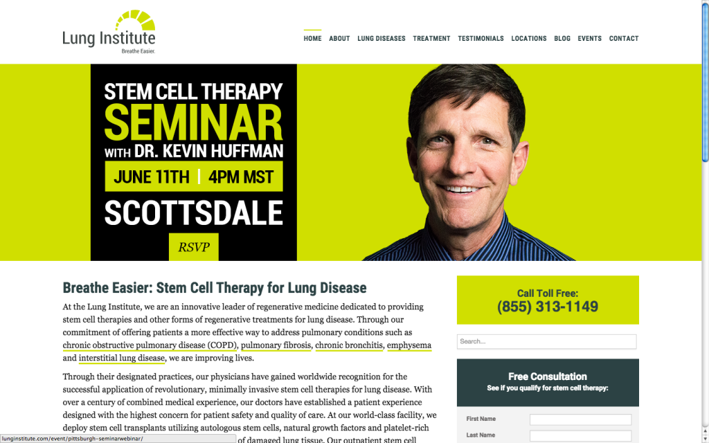
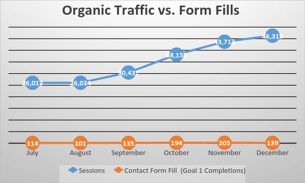
After Study
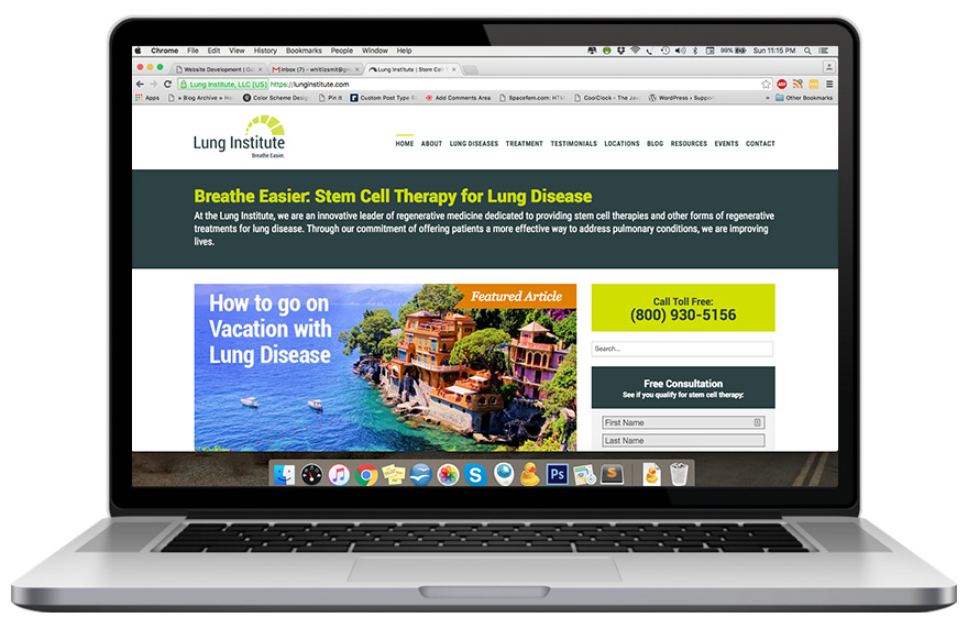
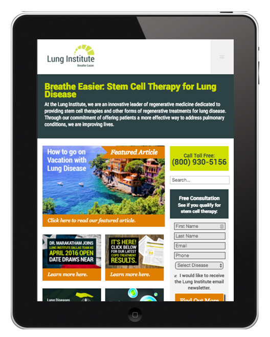
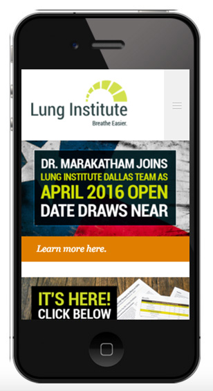
Before Study
Approximately 80% of sales leads came from online sources.
Research and Strategy
Lung Institute Website Conversion Optimization Project
After implementing changes from this research, pages per session increased 23.04%, the bounce rate decreased 9.30% and the exit rate decreased 22.48%.
*April 1 – 15, 2016 compared to the previous period in Google Analytics.
Organic traffic resulted in a larger amount of form fills, as users were better able to navigate the site and find informational content.
Goals
- Improve site navigation to increase accessibility to popular converting pages.
- Increase conversions from non-paid sources, with a focus on organic traffic.
- Inform users and readily deliver relevant information.
Primary and Secondary Target Users
- Primary – Potential Patients
(Most people with chronic lung disease are people who are older than 50 and used to smoke.) - Secondary – Caregivers / Relatives and Doctors
Reference Sites for Senior UX/UI
- UX Magazine “Romancing the Boomer”
- Smashing Magazine “Designing for the Elderly”
- Nielsen Norman Group “Seniors as Web Users”
- U.S. Department of Health and Human Services “Web Usability and Aging”
- Blink UX “Understanding Older Users
Features of Sites Targeting Senior Users
- Large Slide-Out Menu
- Button Links and Standard Color and Underline Text Links
- Boxes to Break Up Content for Legibility
- Large Spacing Around Text
- Lines Between Listed Links
- Breadcrumbs on Article Pages
- Site Map in Footer
Consumer Reports
- A-Z Index in Addition to Search Bar
- Large and Obvious Button Links
- Very Large Heading Text
- Breadcrumbs on Article Pages
Golf Digest
- Large Slide-out Menu
- Suggested Articles Along Top of Article Page
- Lots of Photos, Very Large Headline Link Texts
- Space Around Text and Images
Golf.com
- Slide Out Menu
- Large Link Boxes
- Large Fonts
- Balanced White Space
- Generous Use of Photos
Tactics
After reviewing the site, each main navigation page will be reviewed for content and imagery with more robust, page specific content based on keywords research and formatted for easier consumption of content.
The below tactics will be applied accordingly to the site as a whole or to individual pages.
Content / Images
- Add more robust content and improve formatting for readability with more use of whitespace
- Add more pictures and graphics
- Increase font sizes for headers
- Review images and check for index in search and review best SEO tactics for images
- Change color of call-to-action buttons
- Update copy to create a sense of urgency
Site Overall
- Side bar review – ensure applicable widget, Google internal search, and phone numbers populate on all page
- Incorporate boxes to break up content making it easy to read
- Suggested articles feed with pictures, links, and rollovers.
- Review site map with a focus on resources, media, and press pages and incorporate in a more logical manner.
Navigation
- Add AZ map index
- Improve Breadcrumbs
- Review large Slide-out menu option
- Test feasibility for button like links for mobile and tablet version of website
- Site Map in Footer
- Clean up url structure for consistency among child pages
Calls-To-Action
- Change form fill submission buttons to orange for increased visibility
- Look for other opportunities to incorporate call to action buttons for seminar/webinar signups and newsletter lists